Multiplex Analysis Web Apps
Last Updated: June 4th, 2025
Multiplex Analysis Web Apps (MAWA) is a suite of web-based tools for analyzing multiplex data, from phenotyping through spatial analysis. Users of all skill levels from biologists to imaging experts seeking to uncover relationships between cell populations in their multiplex data can do so rapidly using the intuitive, point-and-click MAWA interface. Those wishing to use MAWA or collaborate on developing additional capabilities are welcome to contact Andrew Weisman or Dante Smith.
Available Apps
MAWA consists of four main components, separated by groups of tabs in MAWA:
- File Handling. These sets of apps are responsible for efficiently transferring data to and from the computational environment. This is particularly useful for saving the results generated by other components of the suite so that the component analyses or visualizations can be quickly re-initialized later.
- Multi-axial Gating. This app allows users to build cell phenotypes by “gating” the intensities of marker proteins. More generally, for any numeric column in an input text file, a filter can be applied on the column by identifying minimum and maximum values within that column, and for any non-numeric column containing 10 or fewer unique values, a filter can be applied by choosing any number of unique values within that column. Multiple filters, one per column, can be generated in order to build a phenotype. Phenotypes can be constructed individually for each image or for the entire dataset at once. The chosen phenotypes can be analyzed and refined in the following Phenotyping app and further run through the following downstream spatial analysis apps.
- Phenotyping. These apps are responsible for identifying the nomenclature for classifying cell types. Whether the input data includes reads in a text file with cells in rows and spatial coordinates and marker positivities/intensities in columns and assigns a phenotype to each cell in the datafile. Current phenotyping methods include “species” (each unique combination of positive markers represents a new phenotype), “marker” (each positive marker is treated as an independent cell), and “custom” (the user utilizes the app to efficiently assign a phenotype to each unique “species” present in the dataset, potentially assigning more than one species to a single phenotype). A fourth phenotyping method in development is multiaxial gating, in which the user defines phenotypes based on the combination of any number of marker intensity ranges. The app includes dynamic scatterplot labeling so the user can clearly visualize the chosen phenotype assignments on the fly. The phenotyper further serves as input to the following two tools that are focused on studying potential interactions between the assigned phenotypes.
- Spatial interaction tool. This app aims to answer the question: “In specific parts of a slide (e.g., tumor region, necrotic region, entire slide, etc.), do cells of phenotype A tend to be interacting with cells of phenotype B, and if so, to what extent?” Density significance heatmaps are employed to visualize results, and metrics can be calculated using a Poisson method, a permutation method defining neighbors by radius, or a permutation method defining neighbors by the k-nearest. A user can input the data for whole slides, and for each slide, the app will automatically partition it into regions of interest (ROIs), perform density significance calculations for every ROI, and average the resulting heatmaps over the ROIs, weighted by annotation region type. Useful visualizations are implemented in the app that allow the user to observe the results on a ROI-by-ROI or slide-by-slide basis.
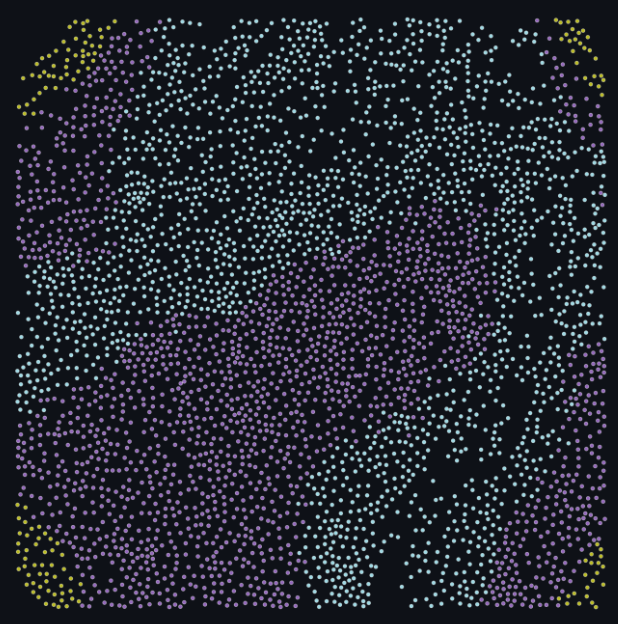
- Neighborhood Profiles Workflow. This app aims to answer the question: “What are the different cellular neighborhoods within the dataset and how do they correlate with other features or response variables?” Counts of cells of different phenotypes are calculated around every cell in the dataset, within concentric annuli; the results are reduced to two dimensions using UMAP decomposition; and the resulting 2D datapoints are clustered together to identify groupings of cellular neighborhoods. The app further provides exploratory visualizations for studying cluster compositions and comparisons and for investigating potential correlations with other features or response variables in the dataset.
Access
NIH users can access a sample deployment of MAWA on the NIH Integrated Data Analysis Platform (NIDAP) here. This instance utilizes a test dataset.
NIH users can request a deployment of MAWA to analyze their own data on NIDAP here.
Alternatively, advanced, non-NIH users can deploy MAWA locally by cloning this repository using git clone git@github.com:ncats/multiplex-analysis-web-apps.git and running ./run.sh in a Python environment that contains Streamlit.
Sample Dataset
To create a simplified and accessible experience, the demo MAWA environment comes bundled with a sample dataset generated from a public repository. Throughout this documentation, example images and dataframes showcase how this dataset is represented in MAWA and provides as a reference for your own testing. The sample dataset was acquired from a recent publication by the Bodenmiller group. Please see the citation and links to the data below.
Windhager, J., Zanotelli, V.R.T., Schulz, D., Meyer, L., Michelle, D., Bodenmiller, B., Eling, N. An end-to-end workflow for multiplexed image processing and analysis. Nature Protocols 18, 3565–3613 (2023). https://doi.org/10.1038/s41596-023-00881-0
Link to article Link to data source
Points of contact
Andrew Weisman (andrew.weisman@nih.gov)
Dante Smith (dante.smith@nih.gov)